Label redesign for a local craft beer brewery focusing on creative storytelling and dynamic design, inspired by Ottawa Anishinaabe legends.

The project reimagines a craft beer label with an emphasis on storytelling and visual impact. Inspired by Ottawa Anishinaabe legends, the design explores how culture and tradition can inform a dynamic, memorable label that stands out on the shelf.
The research phase began with understanding Bicycle Craft Brewery’s tone, audience, and existing product lineup to ensure the new labels aligned with the brand’s personality. From there, extensive exploration of Anishinaabe legends, symbolism, and regional history informed the creative foundation. Care was taken to learn about the meaning behind specific symbols and stories so the visual interpretation remained authentic and culturally conscious.
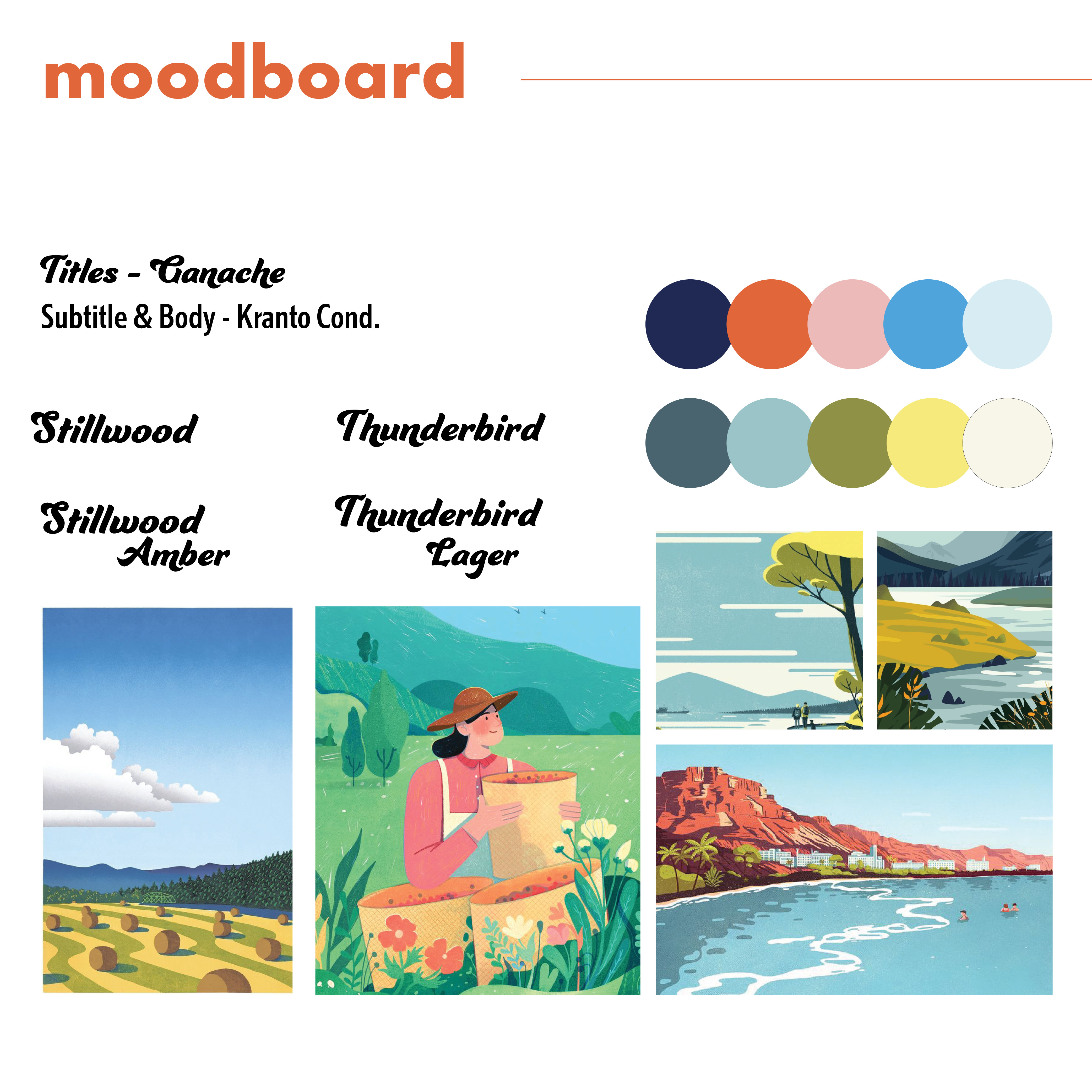
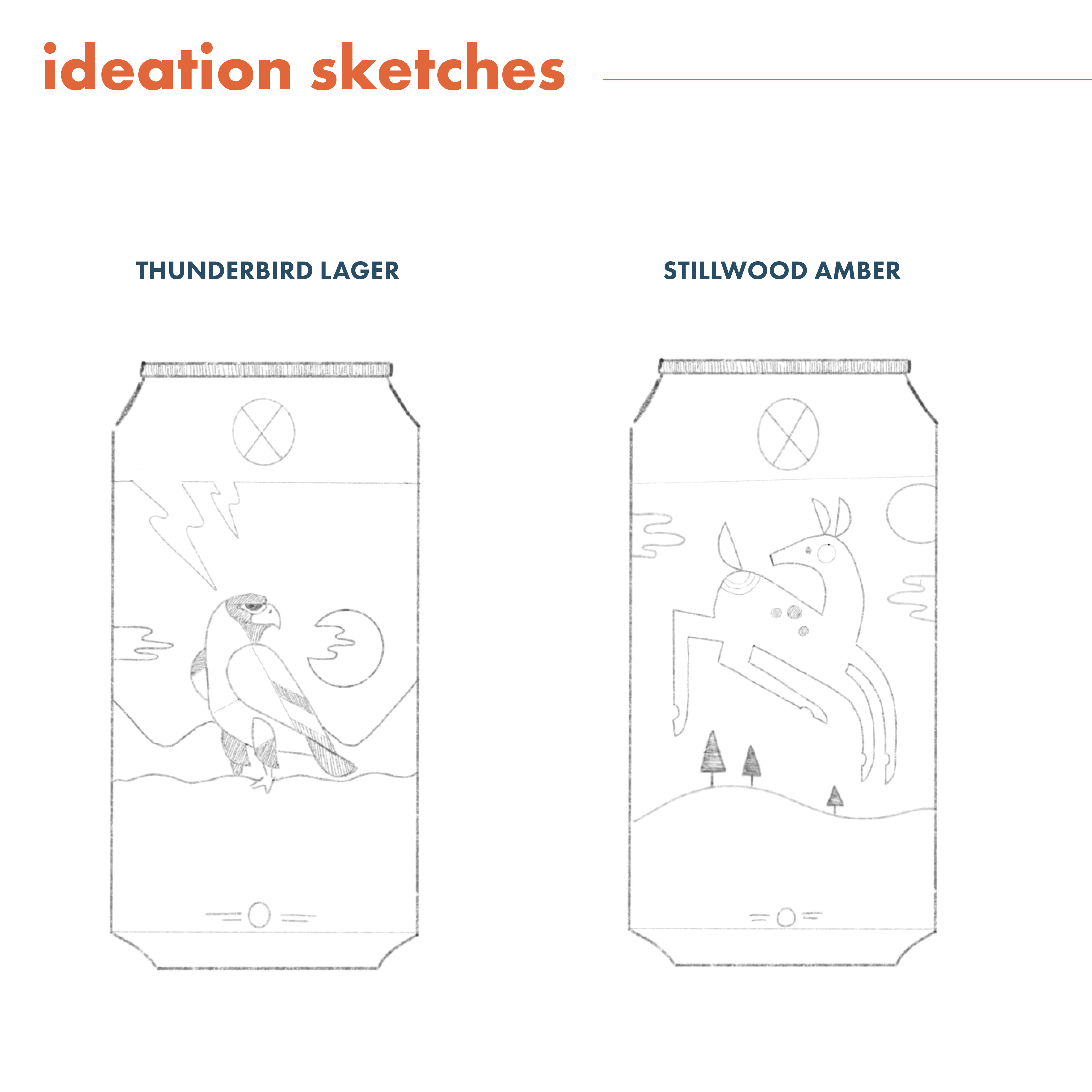
In the ideation stage, early sketches and moodboards helped translate the research into visual concepts. Different ways of interpreting the legends—literal illustrations, symbolic representations, and abstract patterns—were explored to find a direction that honoured the stories while staying modern and marketable. Iterating on colour palettes, compositions, and stylistic approaches helped refine a concept that felt both narrative-driven and cohesive across both labels.
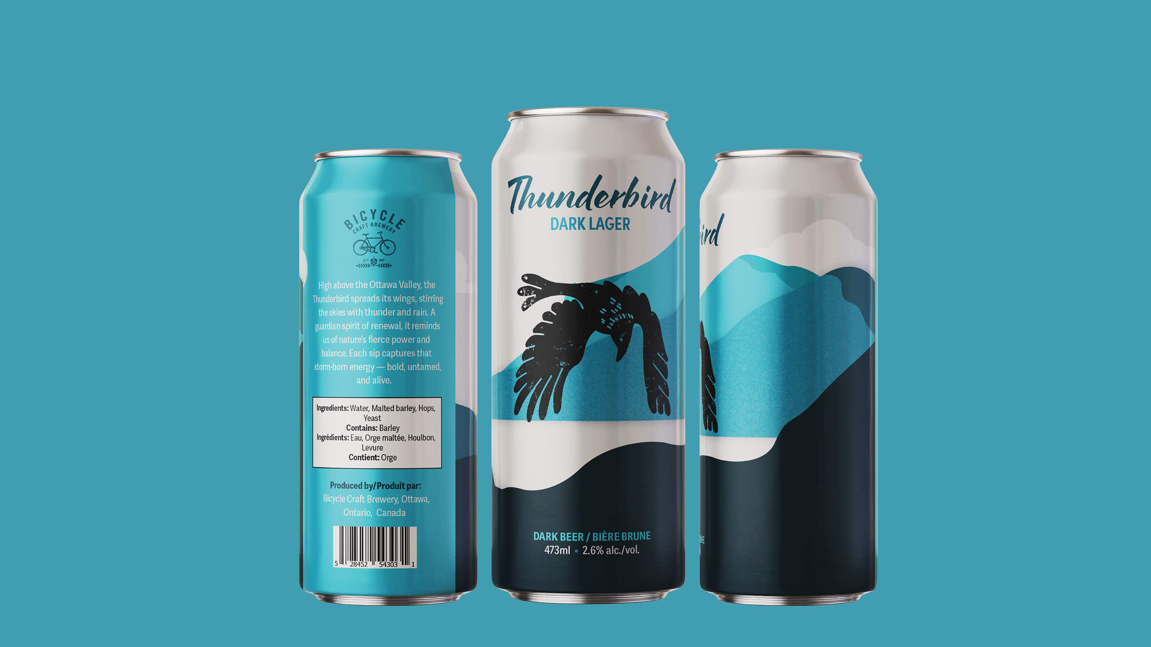
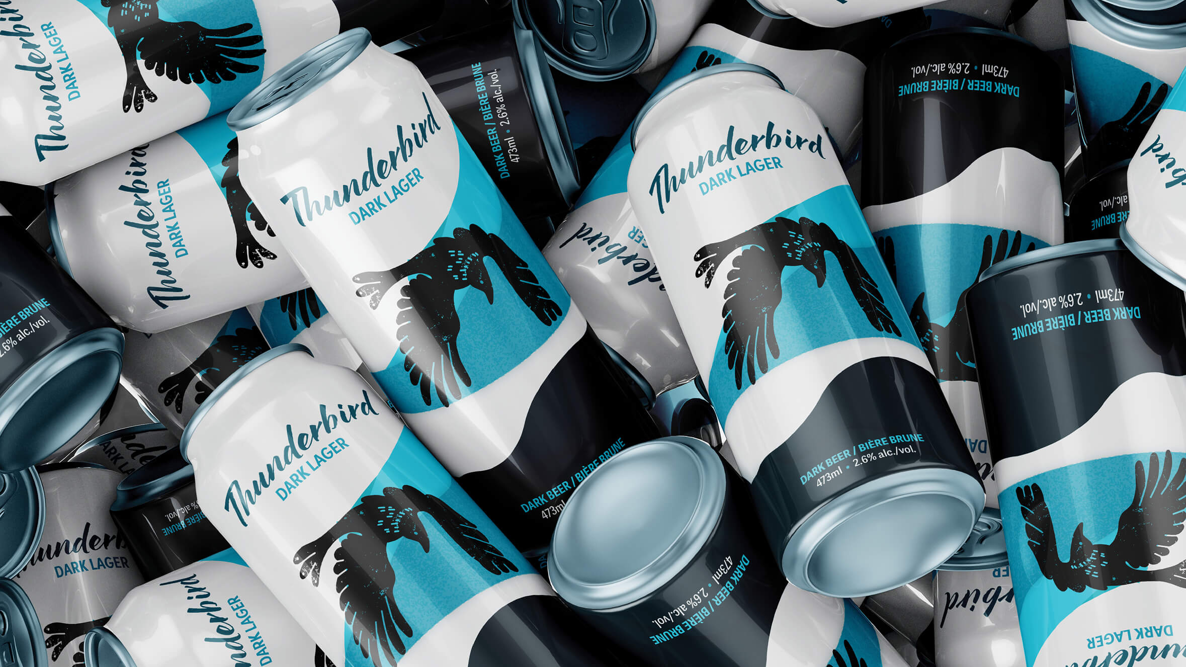
Execution focused on crafting polished illustrations that captured the essence of each legend through bold colour and composition. Label layouts were carefully constructed to balance storytelling artwork with clear hierarchy for product information. Final refinements ensured consistency across the collection—from colour harmony to typographic choices—resulting in a set of cans that stand out visually while remaining true to the cultural inspiration behind them.

The completed label redesign combines bold visuals and narrative-driven elements inspired by local legends. This project allowed me to deepen my understanding of packaging design, visual hierarchy, and how to translate cultural stories into engaging, market-ready graphics.