A website redesign updating Neutrogena’s online presence through refined visual hierarchy, improved user flow, and a cleaner, more cohesive interface.
.jpg)
This project reimagines the Neutrogena website to improve clarity, usability, and trust in a science-driven skincare brand. The redesign focuses on simplifying navigation and strengthening overall visual hierarchy. Through a refined layout and user-centered design decisions, the updated experience enhances how users explore, learn about, and shop for skincare solutions.
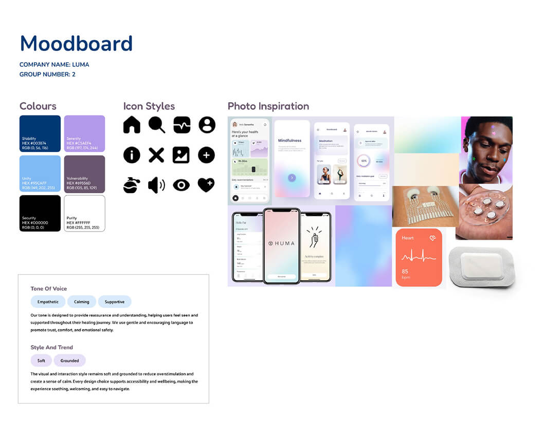
The research phase focused on understanding both business and user goals to guide the direction of the website redesign. Moodboarding was used to explore visual references and define a clean, clinical, and trustworthy aesthetic. A clear tone of voice was also established to ensure the site communicated scientific credibility while remaining accessible to users.
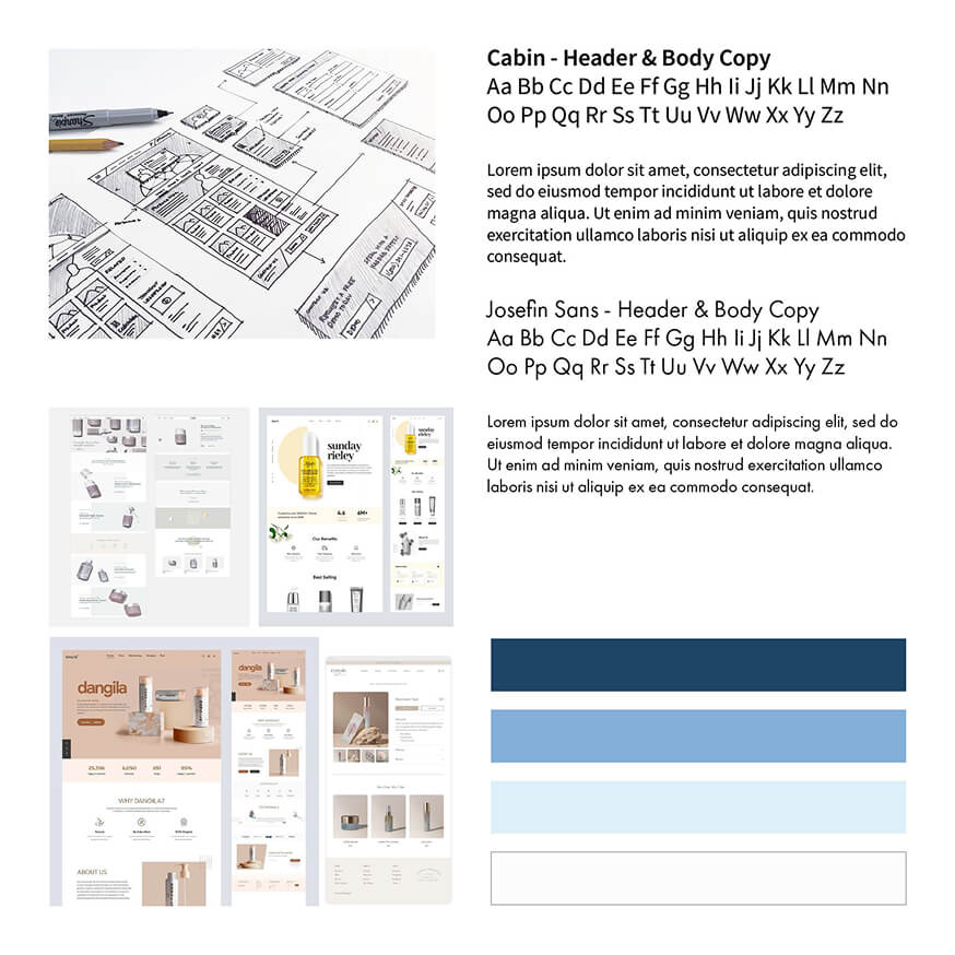
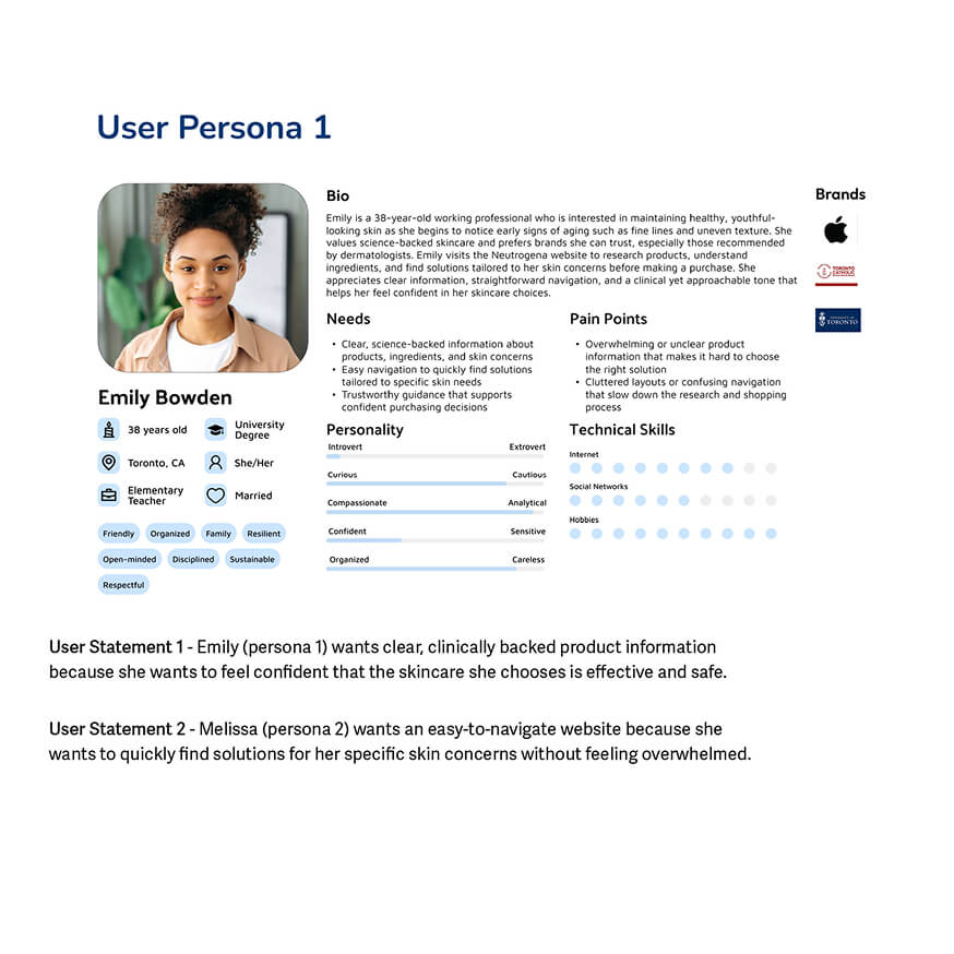
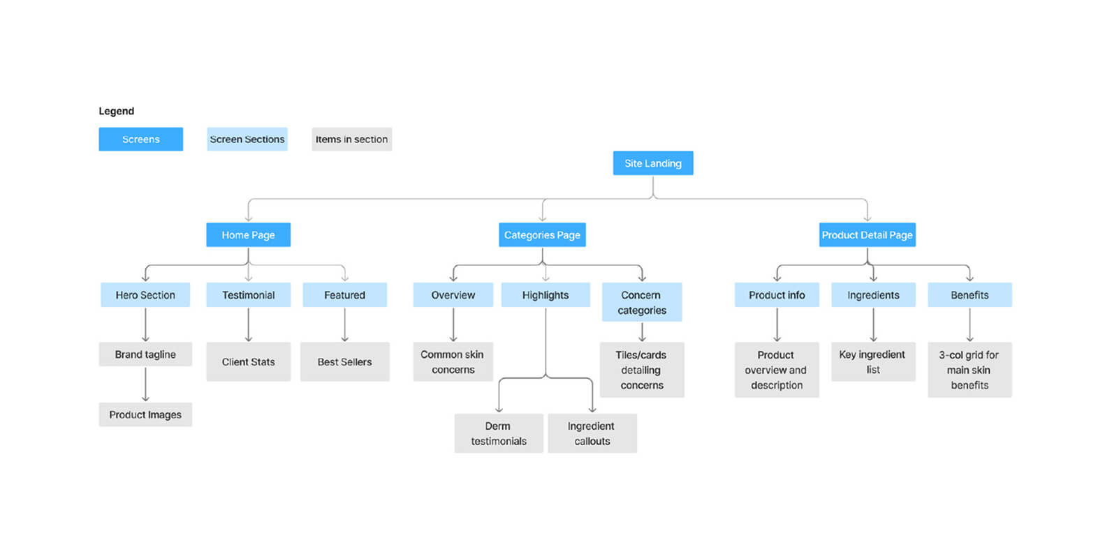
The analysis phase focused on translating research insights into a structured design framework. User personas were created to represent key audience needs and behaviours, while site maps were developed to visualize navigation and content hierarchy. A style guide was created to ensure visual consistency and establish a clinical, trustworthy tone across the redesigned website.
The initial wireframing phase focused on mapping out page layouts and core user flows for the redesigned website. Simple wireframes were used to explore navigation, content structure, and hierarchy without visual styling. This phase allowed for quick iteration and refinement of usability before moving into higher-fidelity design.
.jpg)
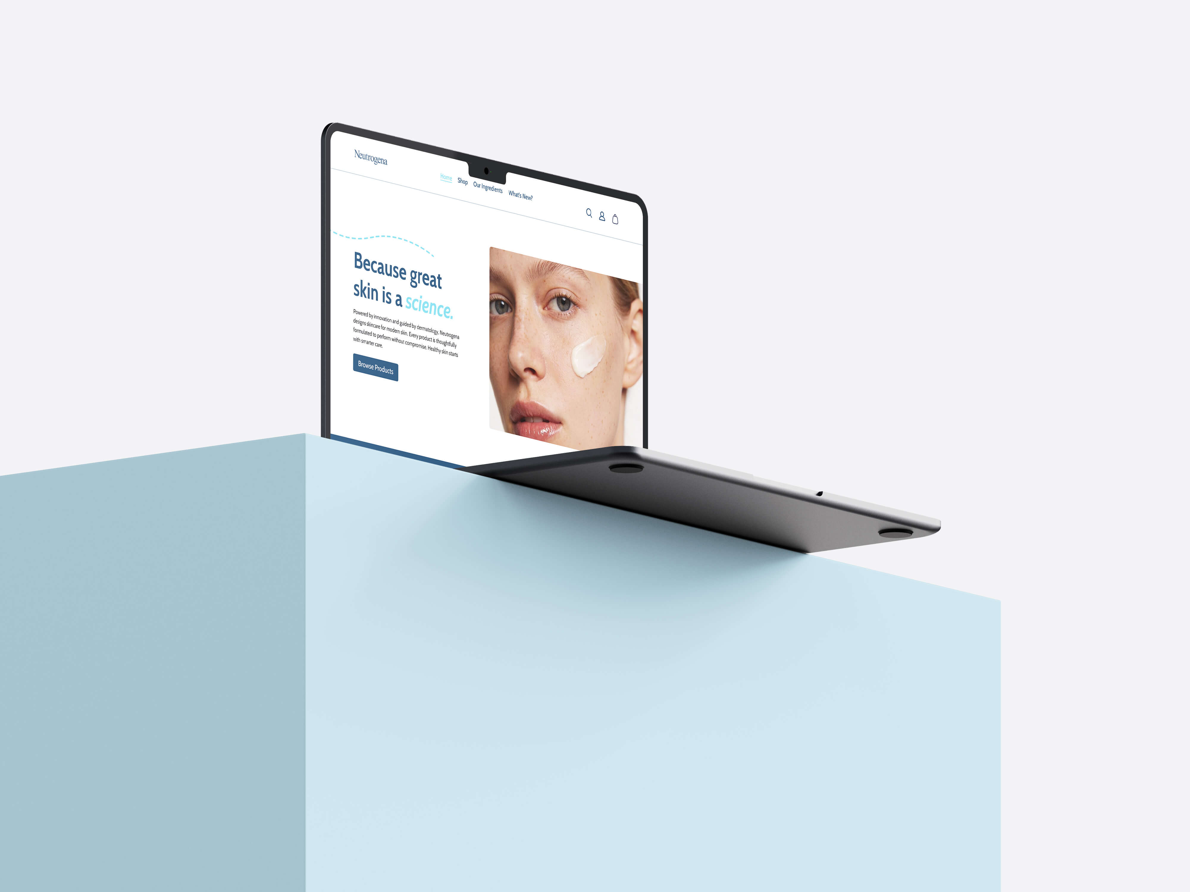
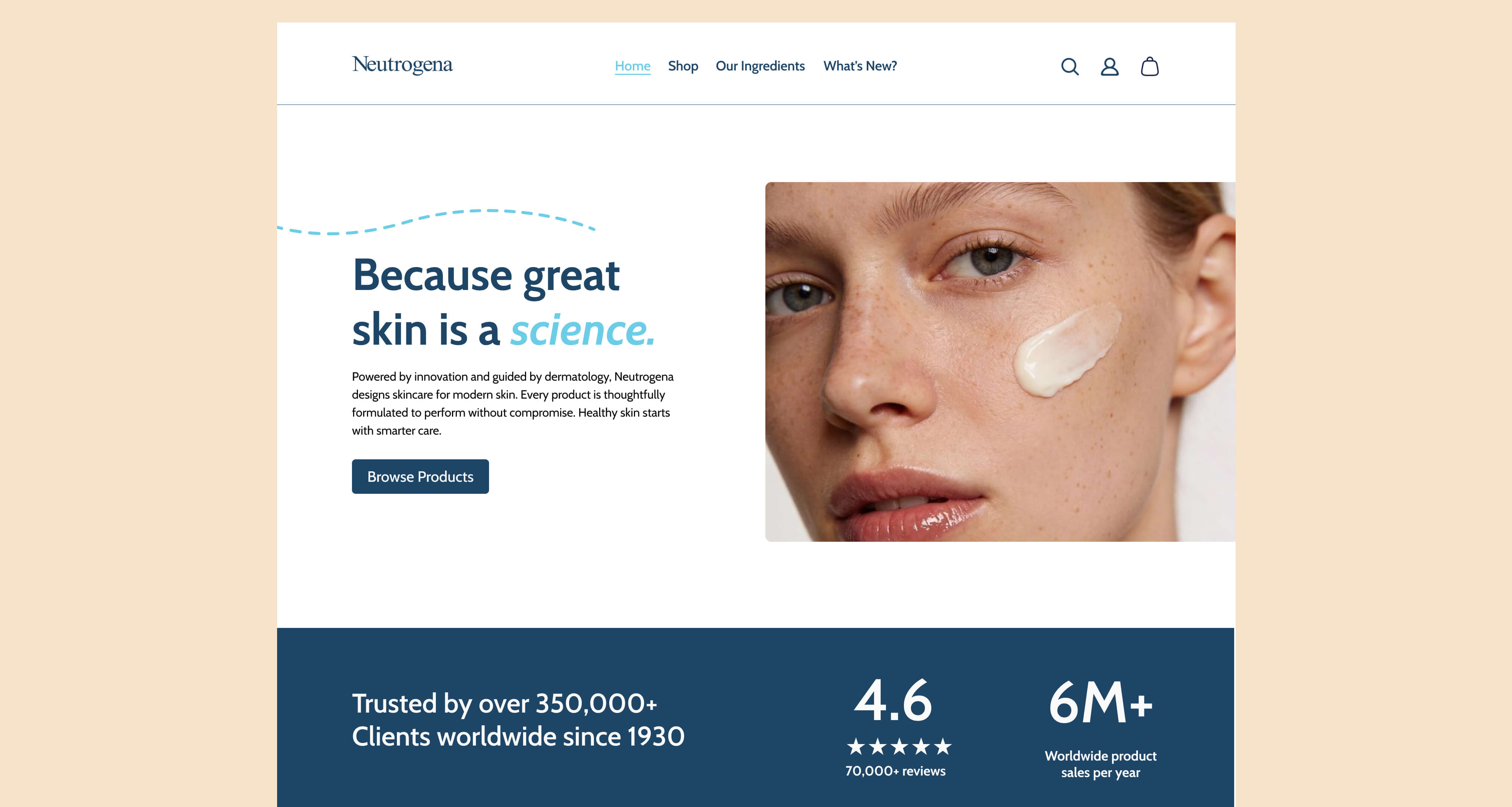
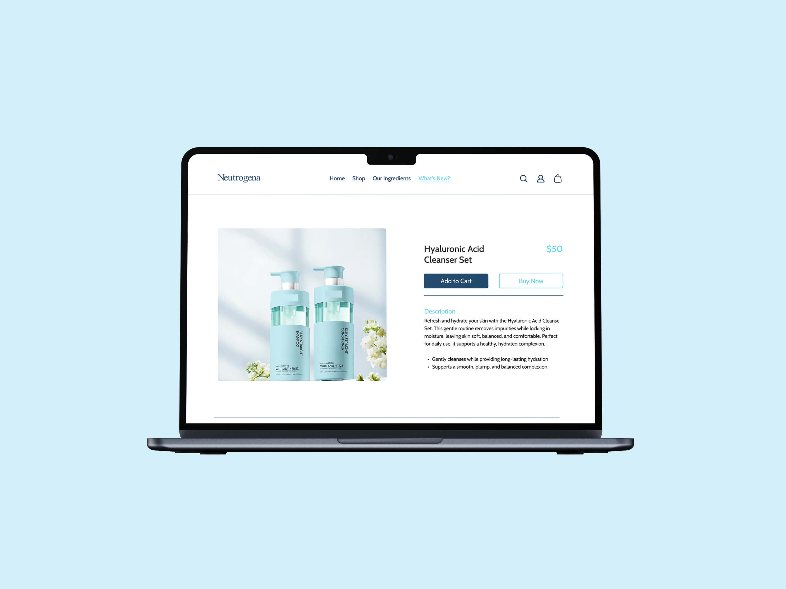
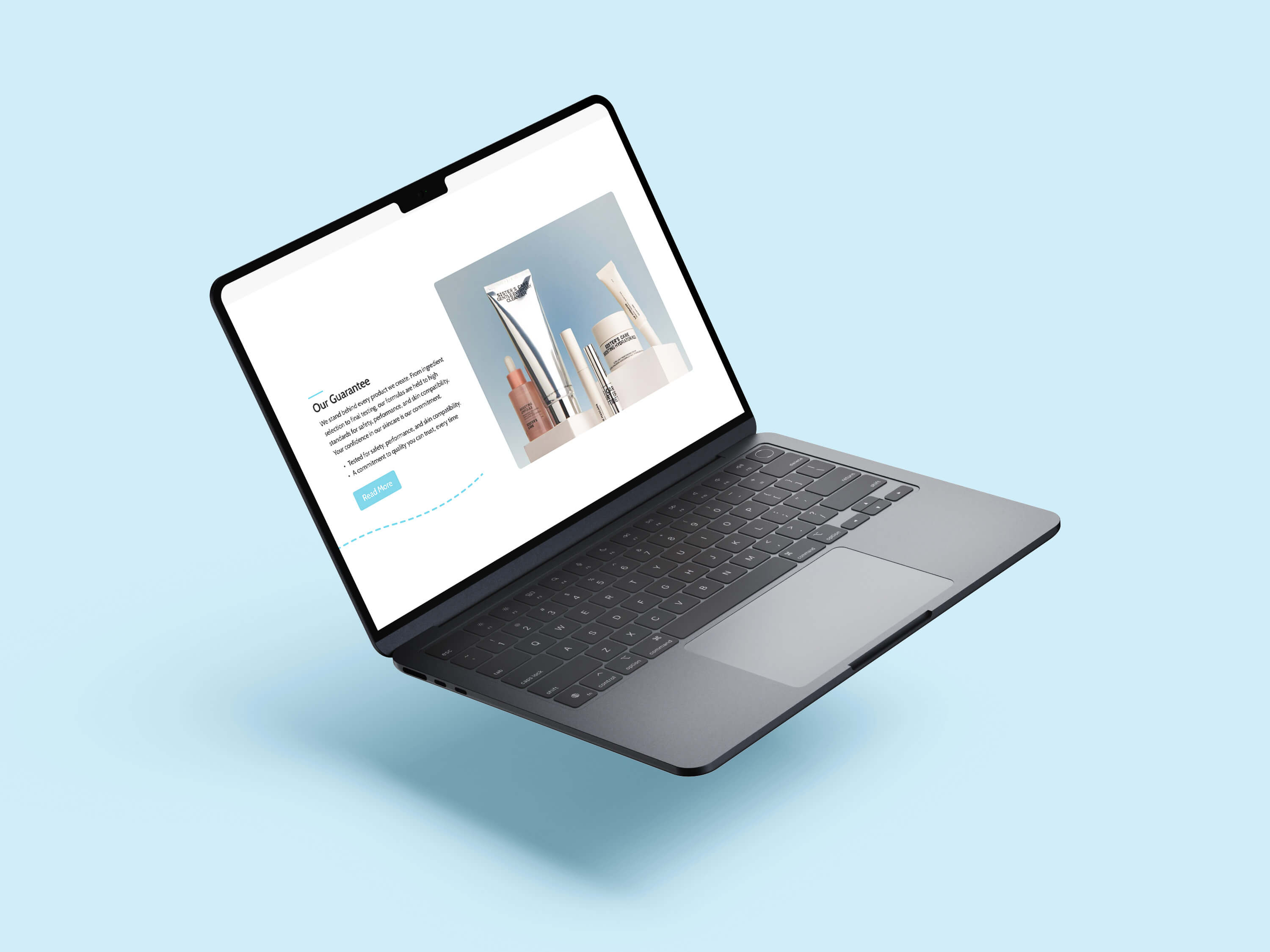
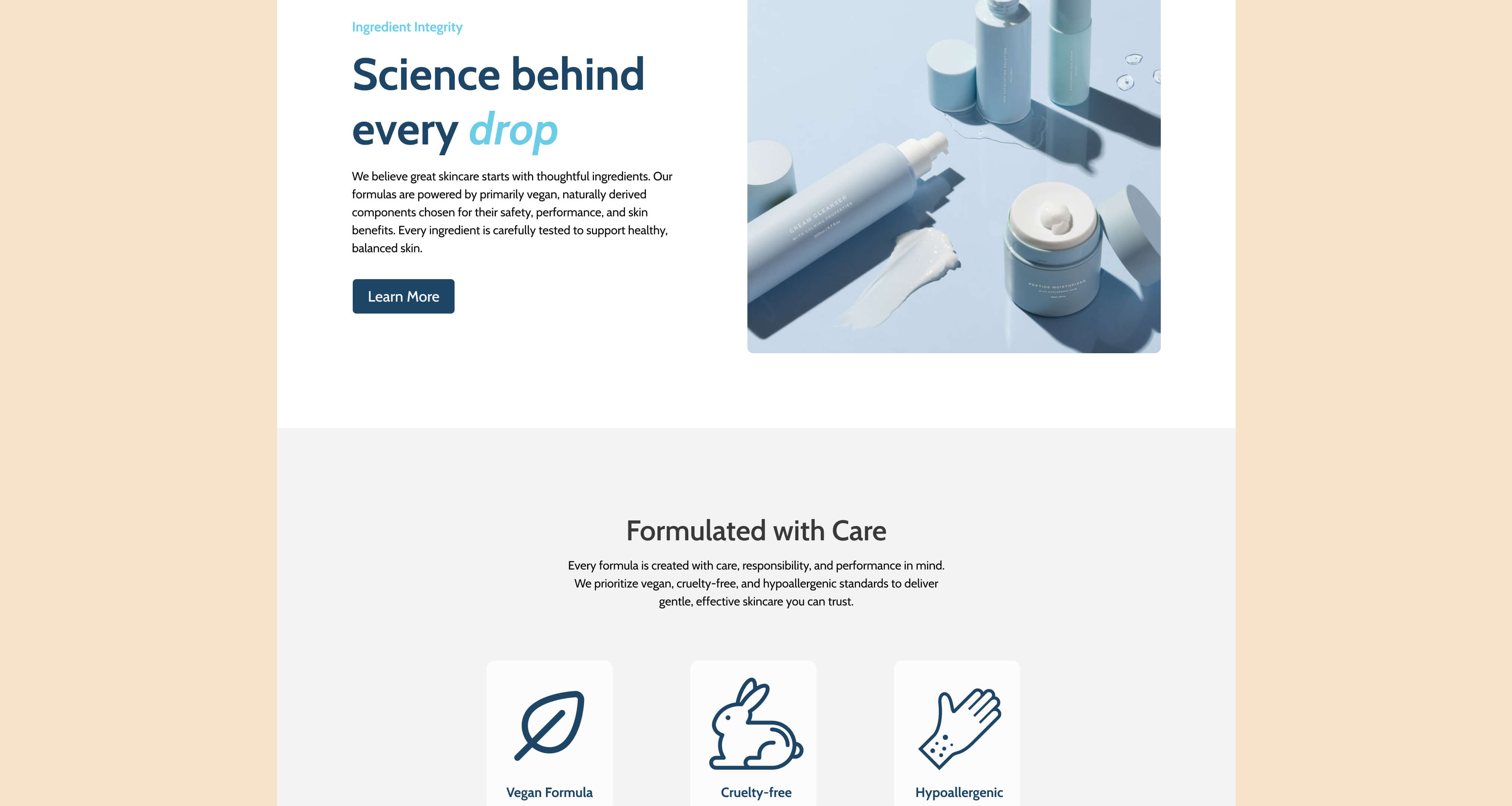
The high-fidelity phase focused on refining the low-fidelity wireframes and applying the established style guide to create a polished, realistic representation of the final website. Visual design, typography, and imagery were integrated to strengthen clarity and reinforce Neutrogena’s clinical brand identity. This phase ensured the redesigned site was cohesive, intuitive, and ready for user-facing interaction.
The Neutrogena redesign reinforced the importance of aligning user needs with brand goals. Iterating through wireframes highlighted how clear hierarchy and consistent visuals improve usability and trust. This project strengthened skills in user-centered design, visual communication, and creating cohesive, polished digital experiences.