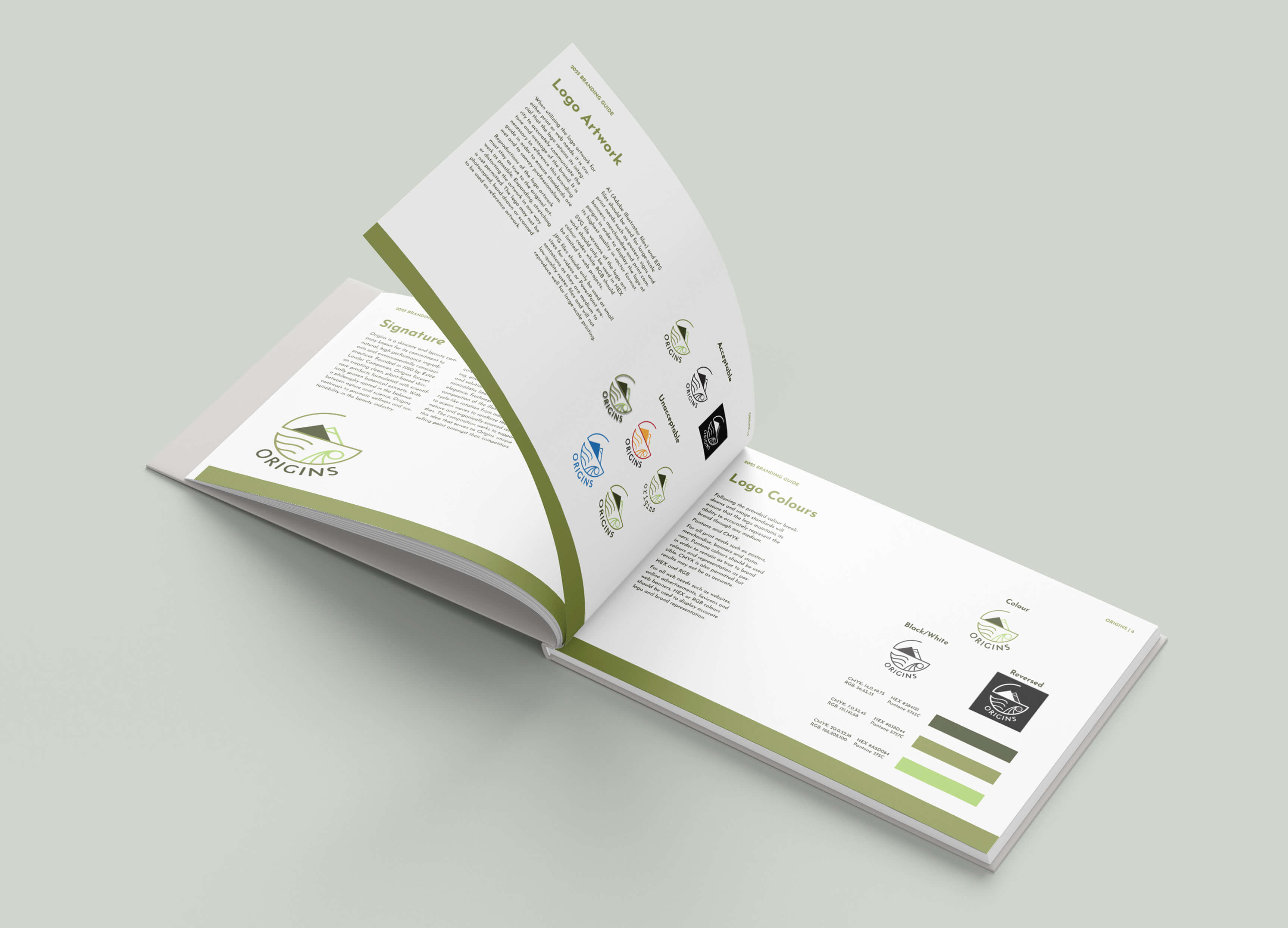
Redesigned brand identity for Origins beauty company focusing on clarity, accessibility and authenticity.
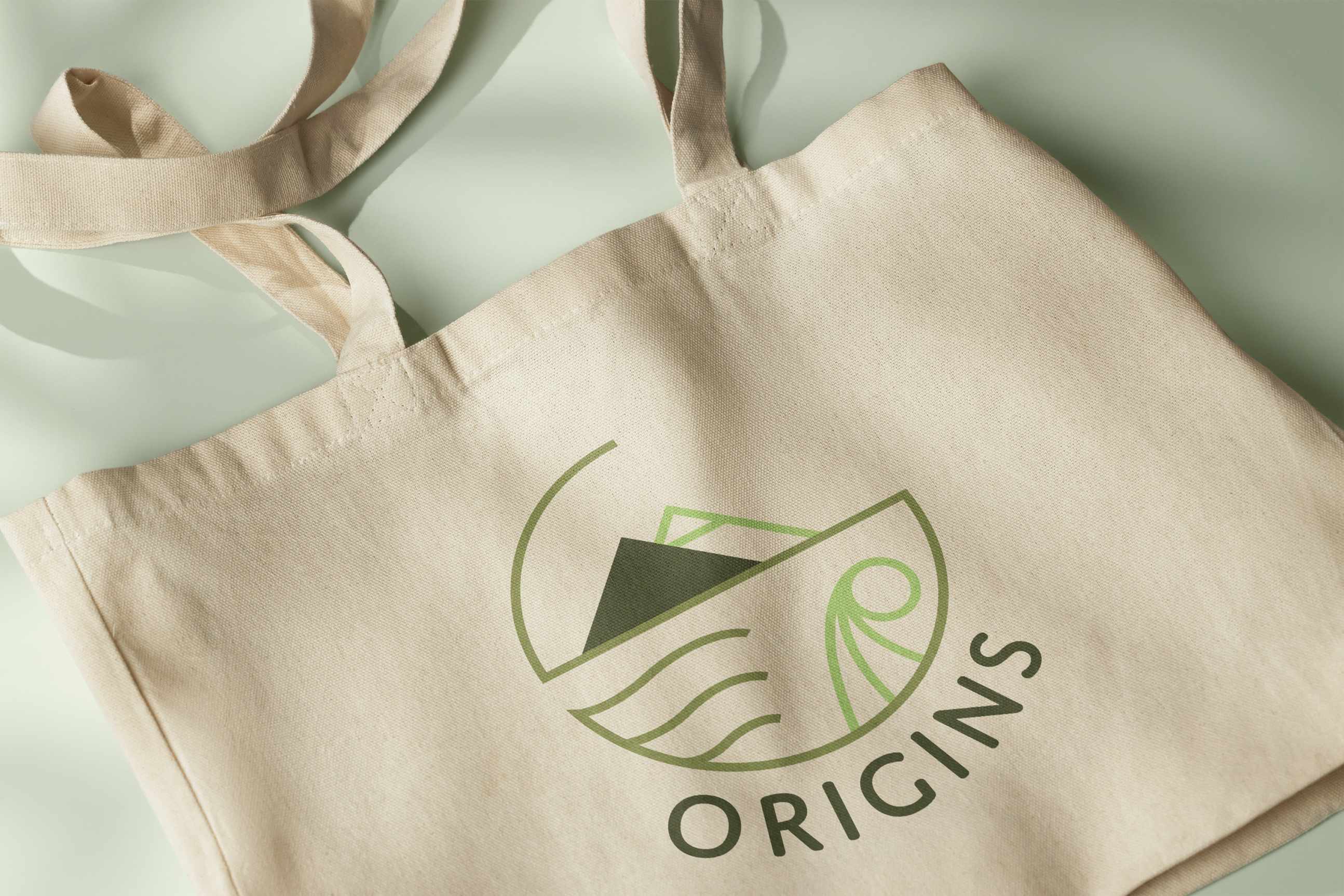
This project is a visual rebrand of Origins, focusing on creating a modern, cohesive identity that reflects the brand’s natural and botanical roots. The redesign emphasizes clarity, flexibility, and a fresh visual language across digital assets, marketing materials and branding guides.
To ensure the rebrand was effective, thorough research was conducted across several areas. Industry research provided insight into current beauty branding trends, while target audience and consumer research helped identify the values and expectations of Origins’ customer base. A competitor analysis revealed opportunities to differentiate the brand from its rivals, highlighting gaps and strengths in how other skincare companies present themselves.

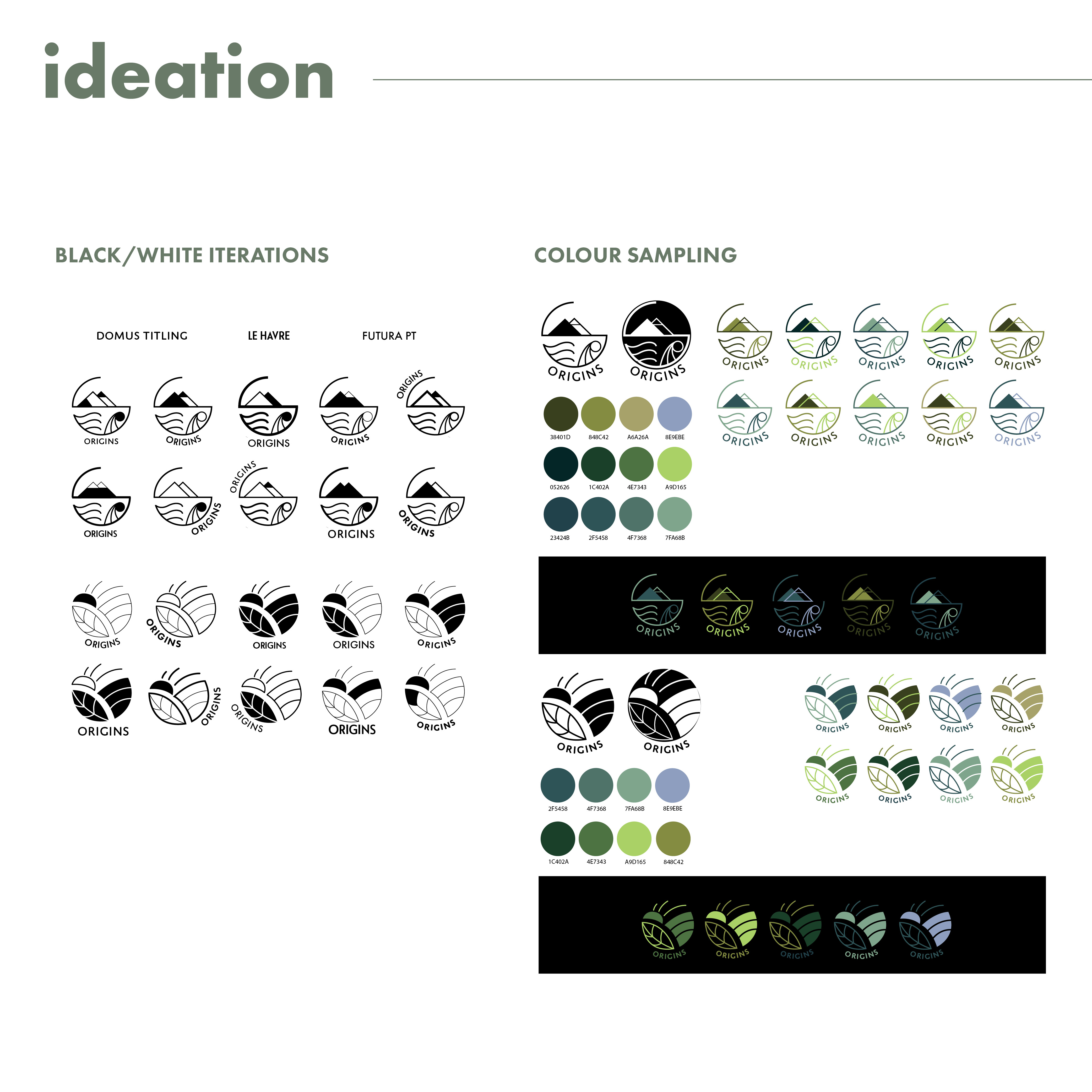
The ideation phase began with extensive brainstorming and sketching to explore multiple directions for how the refreshed logo and identity could embody Origins’ modern persona. Initial sketches experimented with typography and interpretive graphics while concept development refined these ideas into stronger, cohesive visuals.
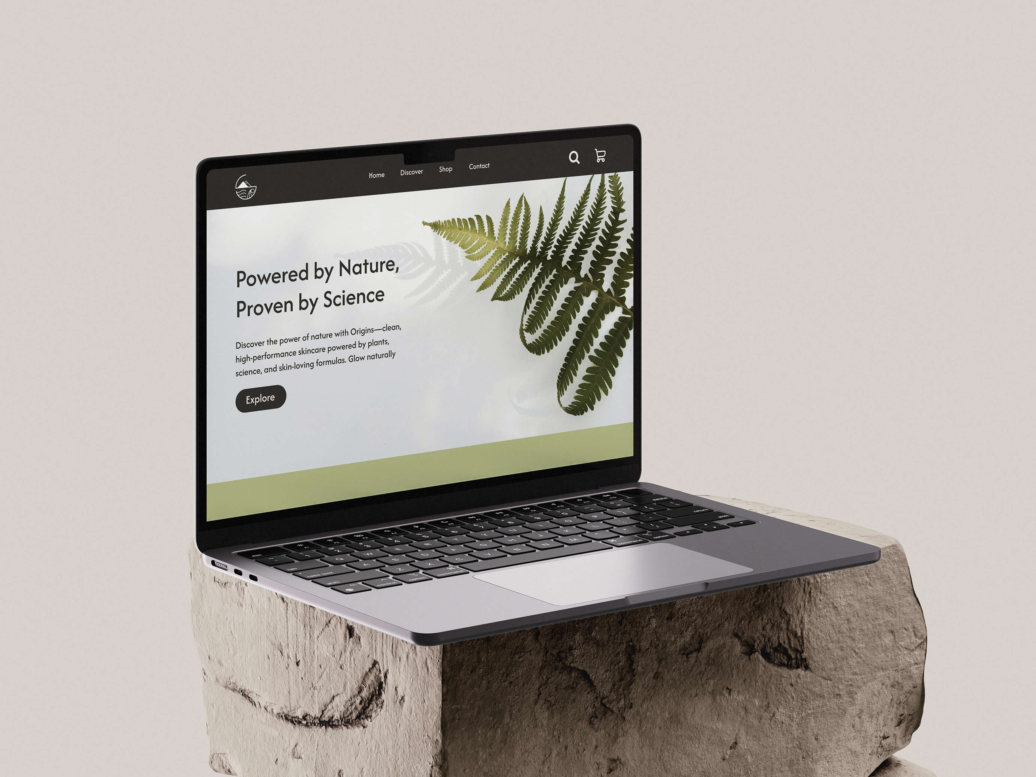
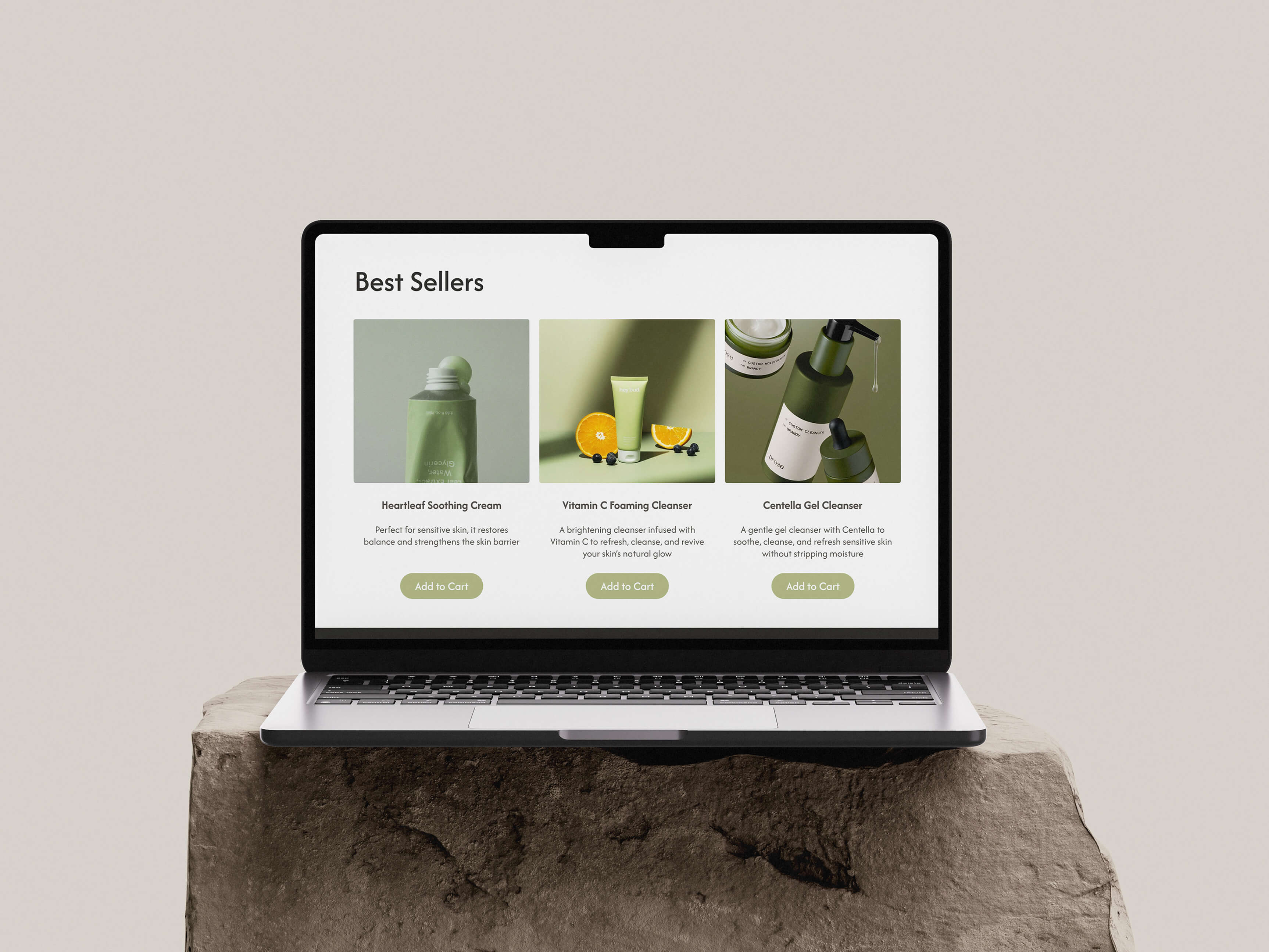
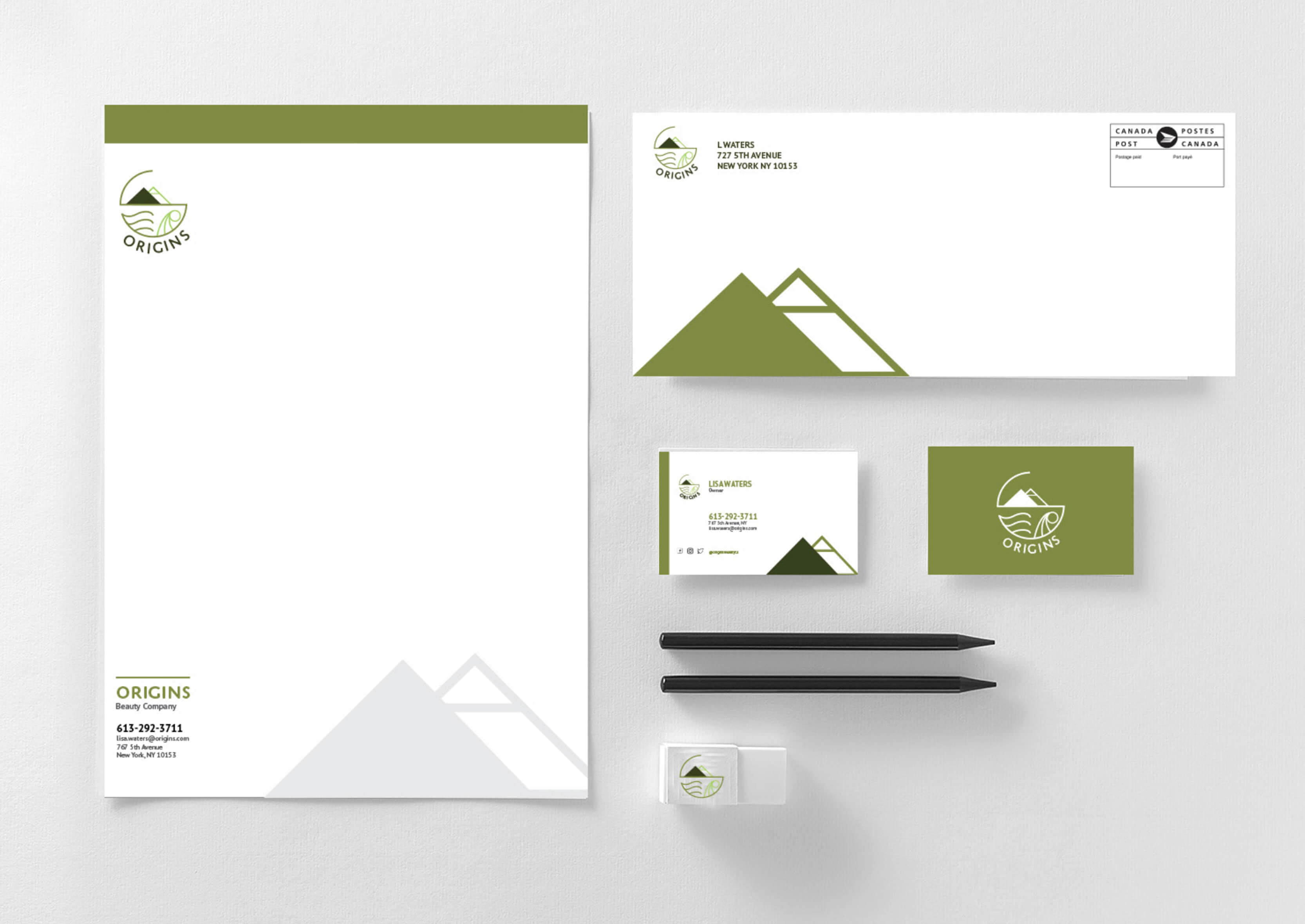
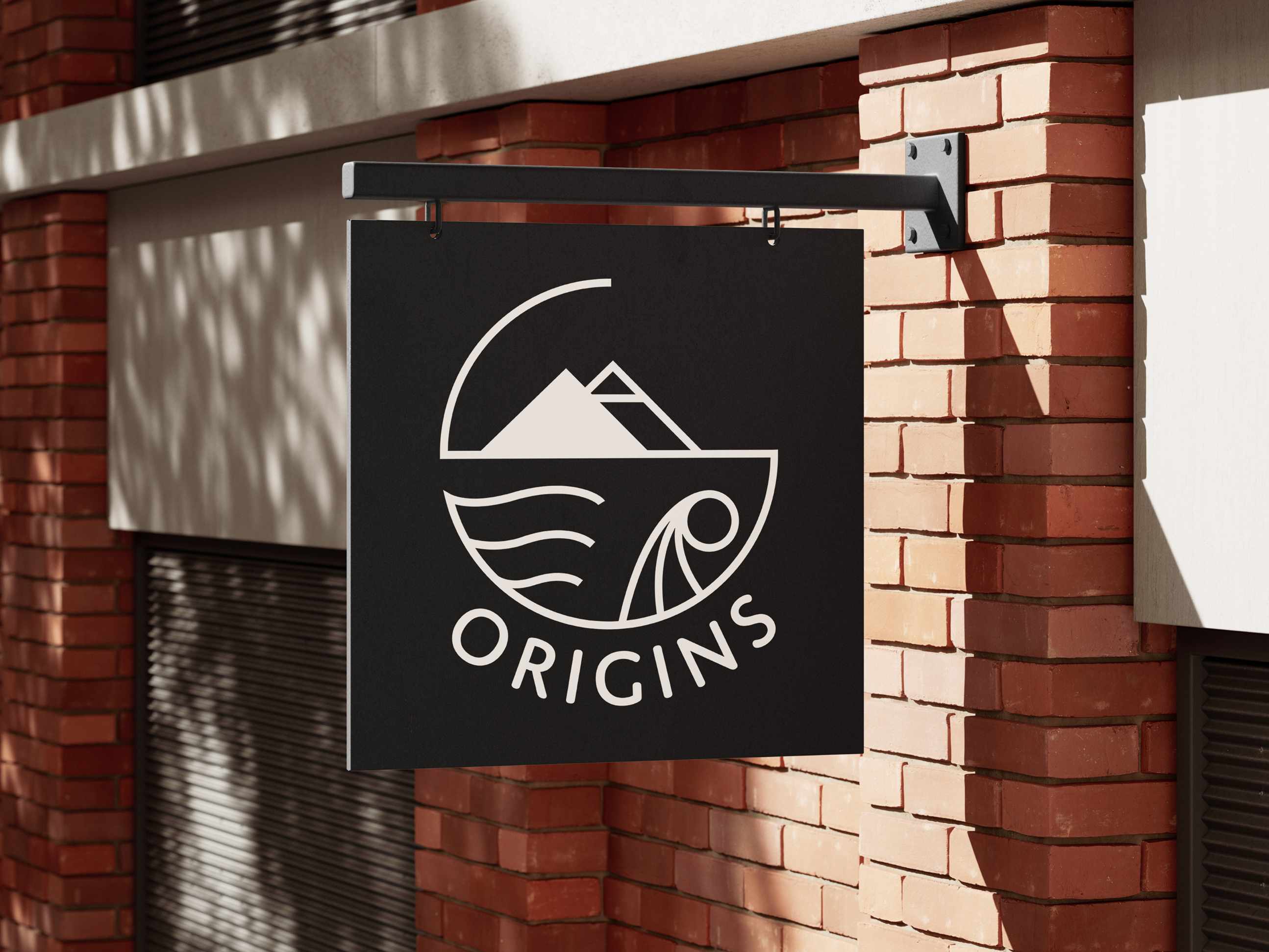
In the execution phase, the strongest concepts from ideation were rendered into polished visual designs, including the finalized logo and stationery. Prototypes of the website mockup were developed to test how the new identity worked across different formats. Multiple iterations were created, with refinements made based on feedback to ensure cohesion and a strong connection to Origins’ brand values.
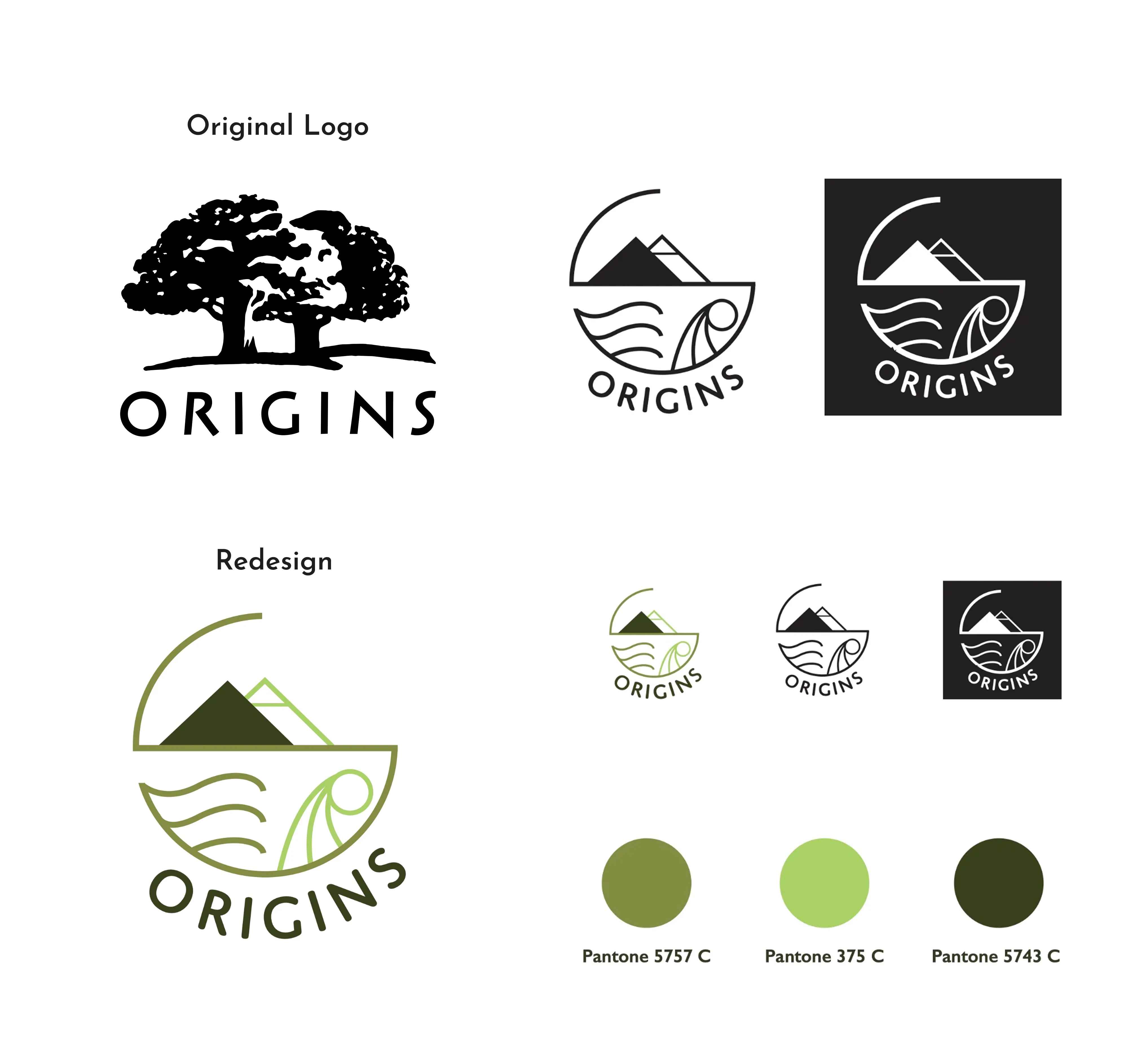
The rebrand delivers a refreshed, contemporary look for Origins while staying true to its botanical inspiration. This project helped me develop a deeper understanding of translating brand values into visual language and designing an identity that is both flexible and recognizable across various applications and media.