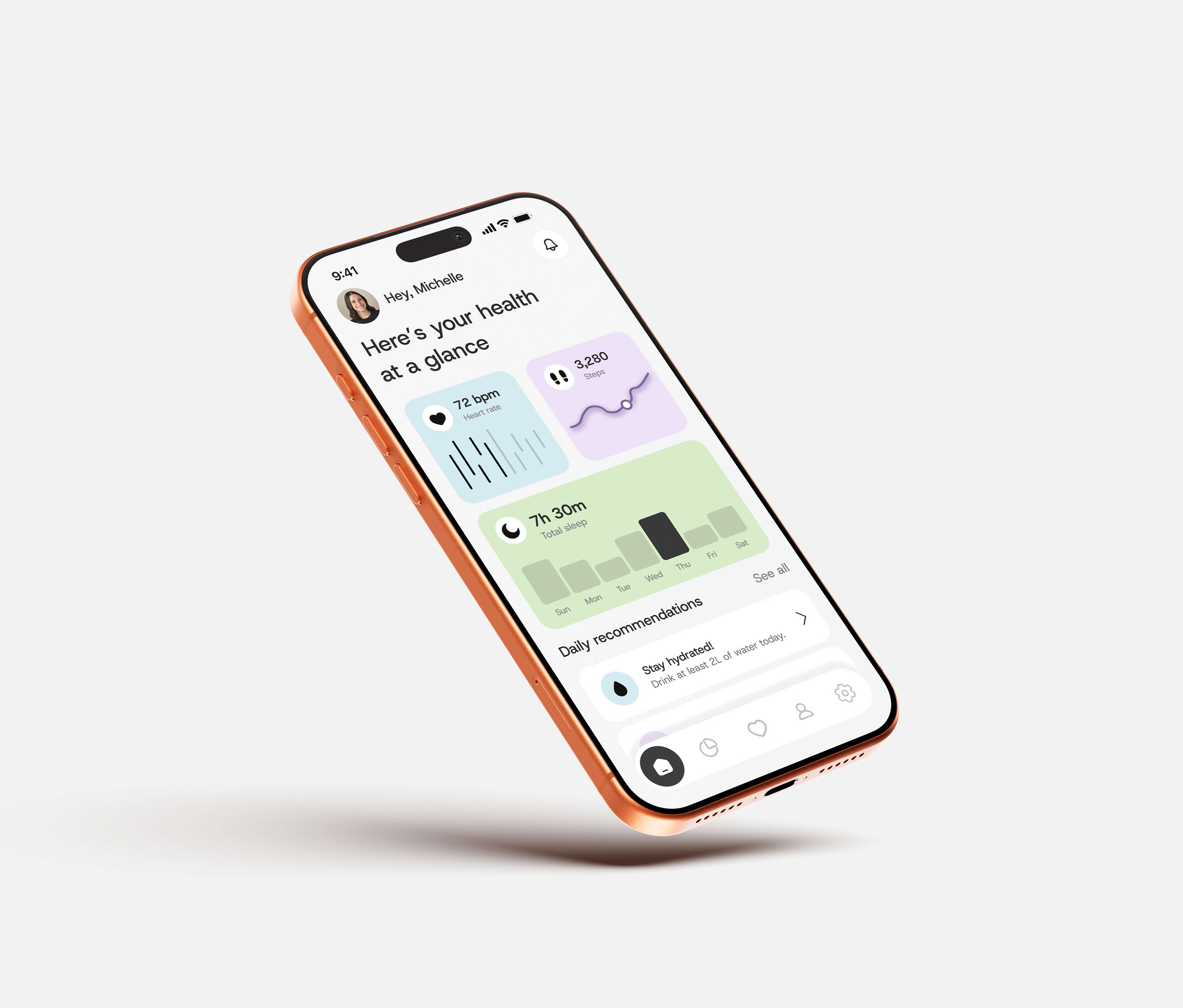
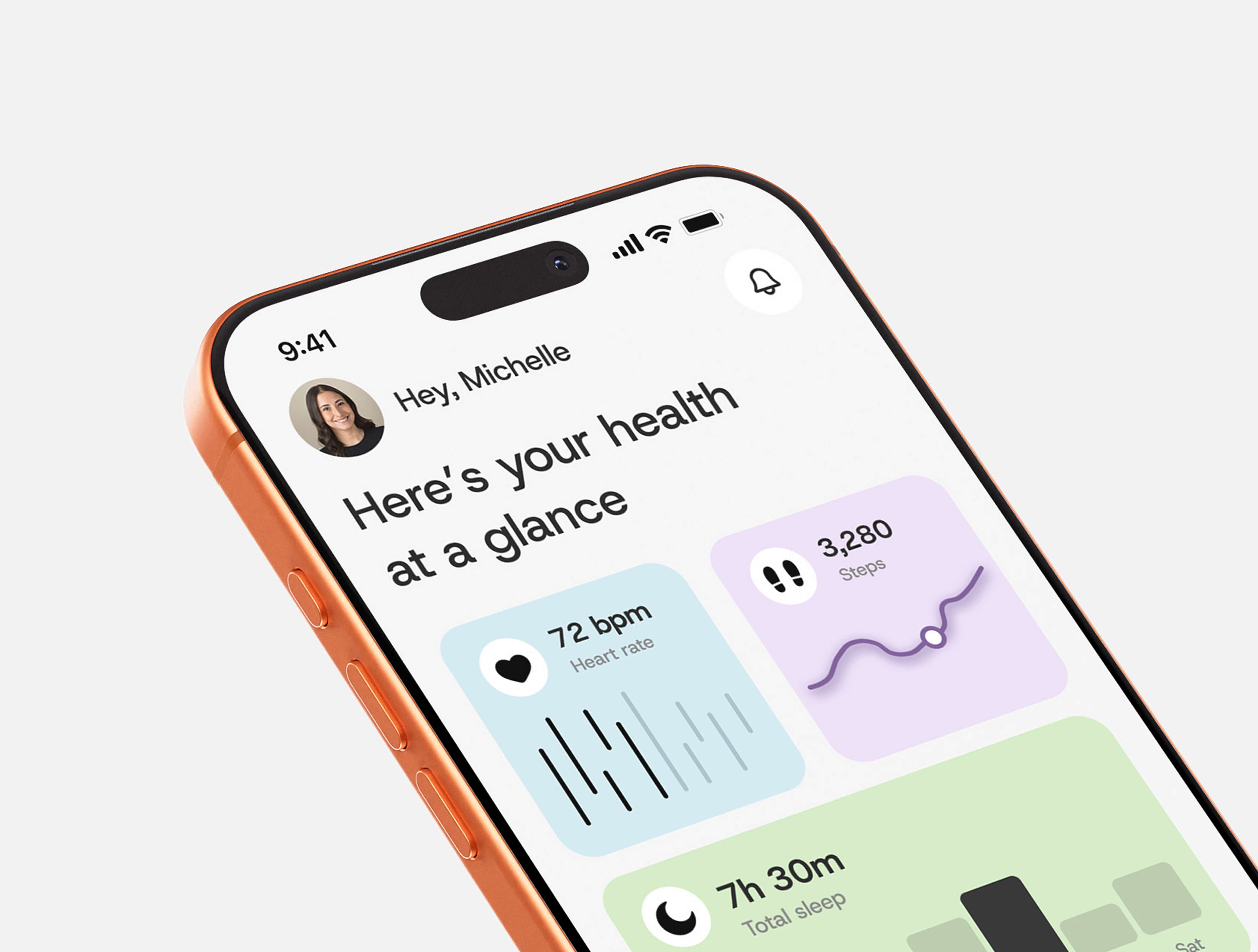
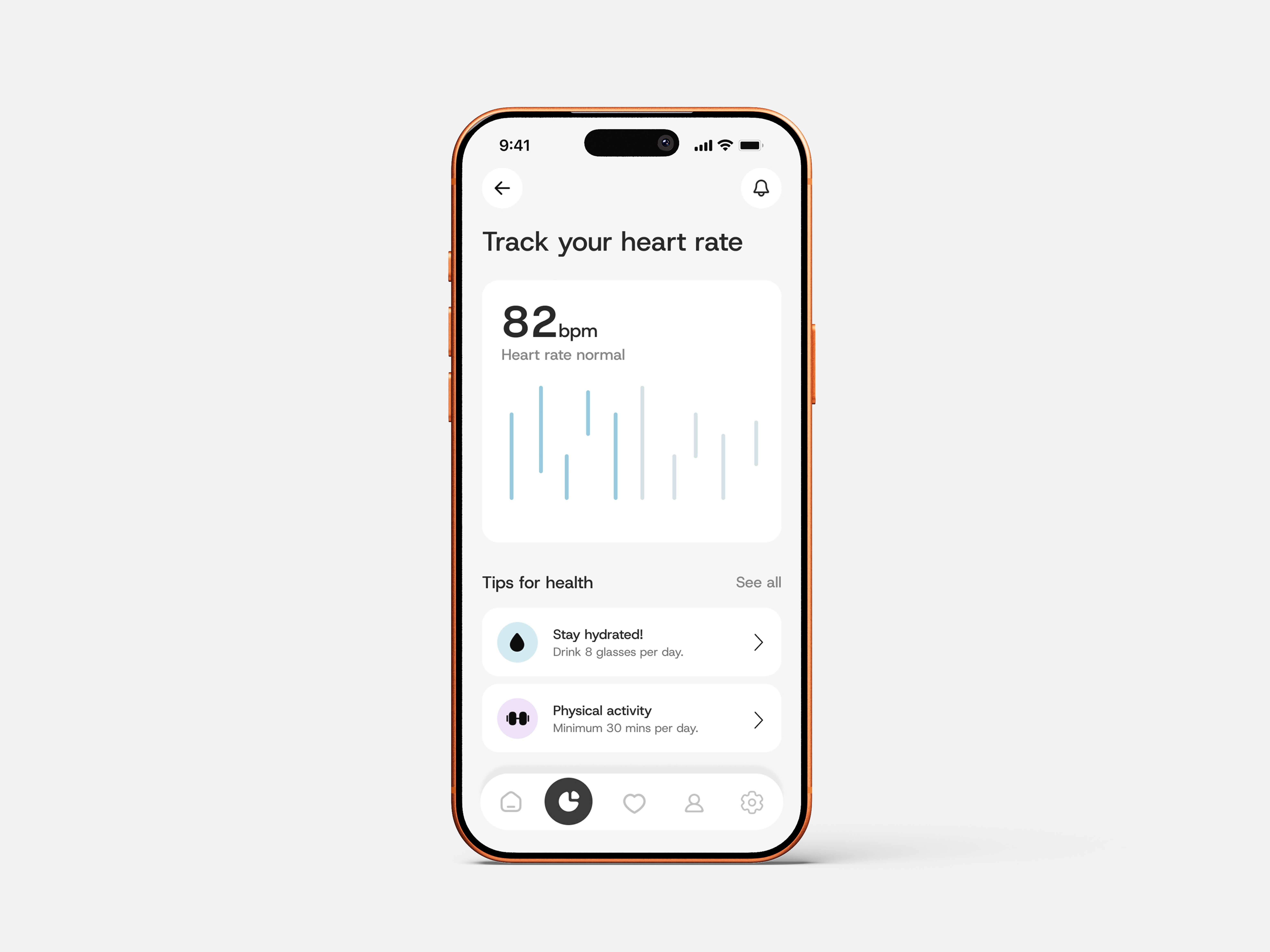
A health and fitness app that strips wellness tracking back to what matters — giving busy professionals a clear view of their daily health in seconds.

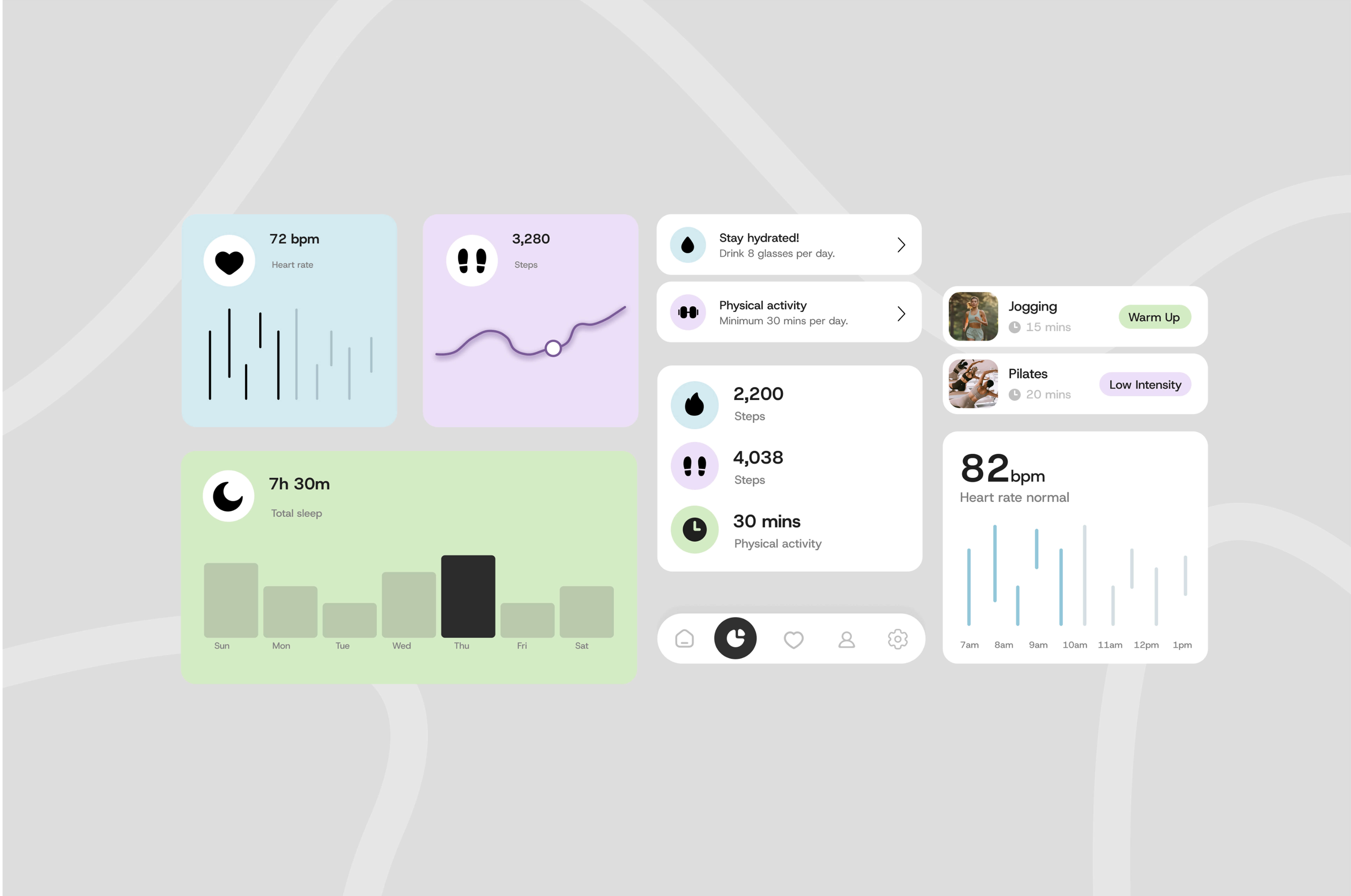
A mobile health tracking app designed for busy professionals who want to stay on top of their fitness without the friction of overcomplicated tools. The goal was to strip health tracking back to its essentials — a clean, glanceable dashboard surfacing heart rate, steps, sleep, and daily goals in one place, with low-effort logging and smart reminders that fit around a demanding schedule rather than competing with it.
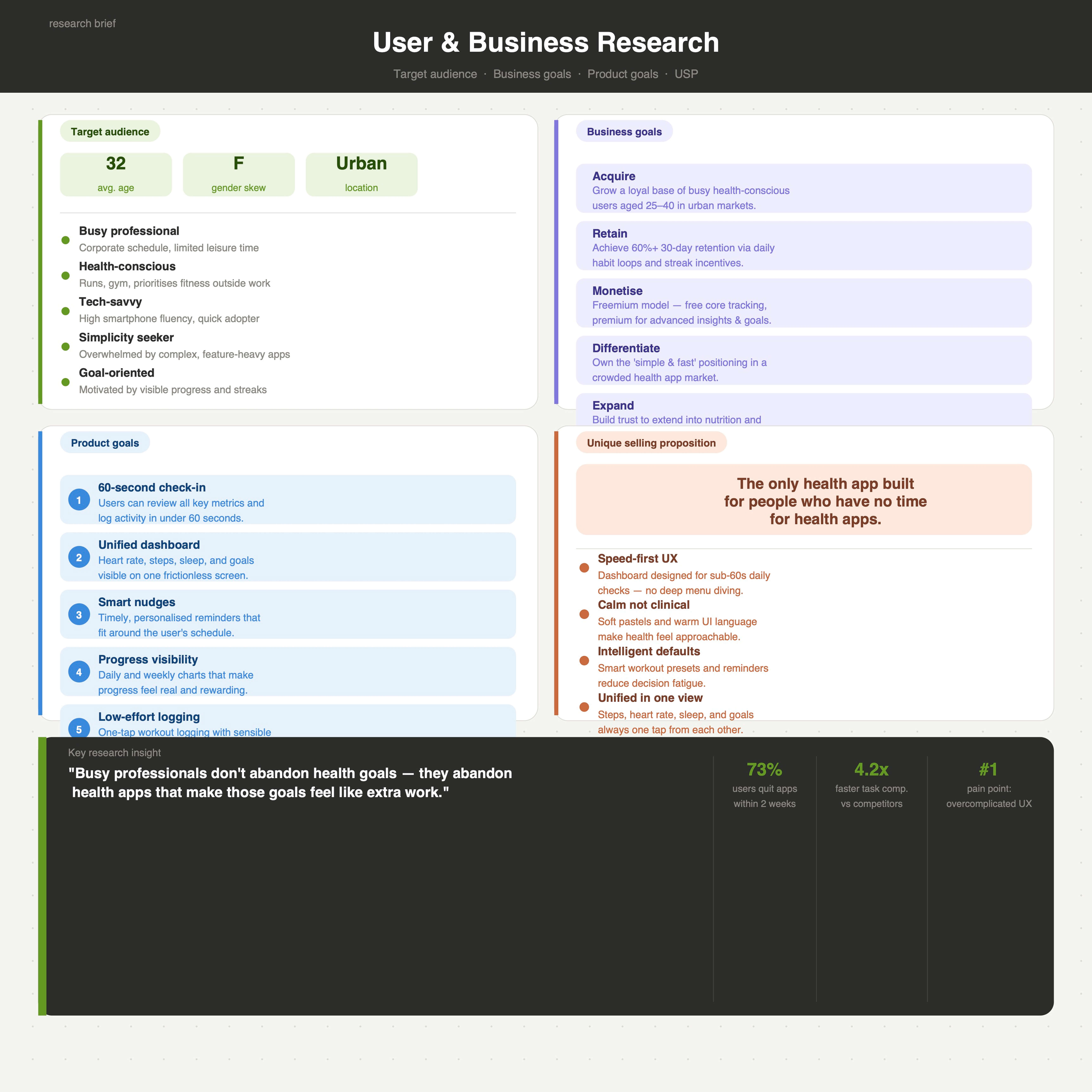
The research phase began by defining the user, business, and product strategy that would ground the design decisions already made. A primary persona — Michelle, a 32-year-old corporate professional and avid runner — was developed to anchor every UX consideration. Key insights emerged around a single tension: the target audience is highly health-motivated, yet consistently abandons apps that add cognitive load rather than reduce it. This shaped the product's core principle: speed and clarity above all else.
The analysis and ideation phase involved developing user personas to represent primary and secondary users and better understand their needs. A clear tone of voice and visual direction were established through moodboarding to guide the overall experience. Product and user flow diagrams were created to map out app navigation and device interaction. This phase translated research insights into a structured, user-centered framework for both the app and wearable device.
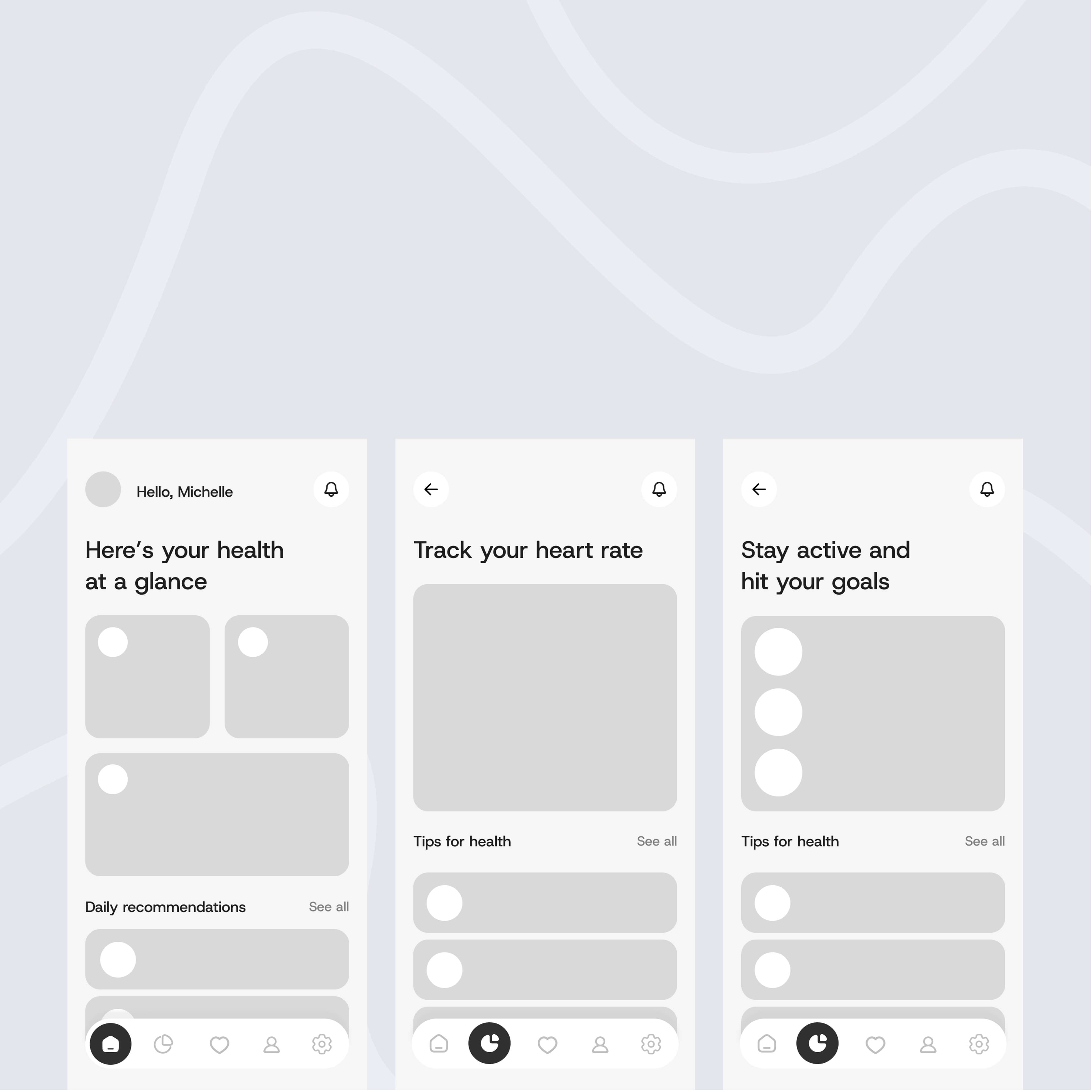
The early design phase focused on low-fidelity wireframes to explore layout, features, and how users would navigate through the app. These rough designs allowed for experimentation to identify what worked without worrying about visuals. Testing and iterating on these wireframes helped uncover usability issues and opportunities early on.
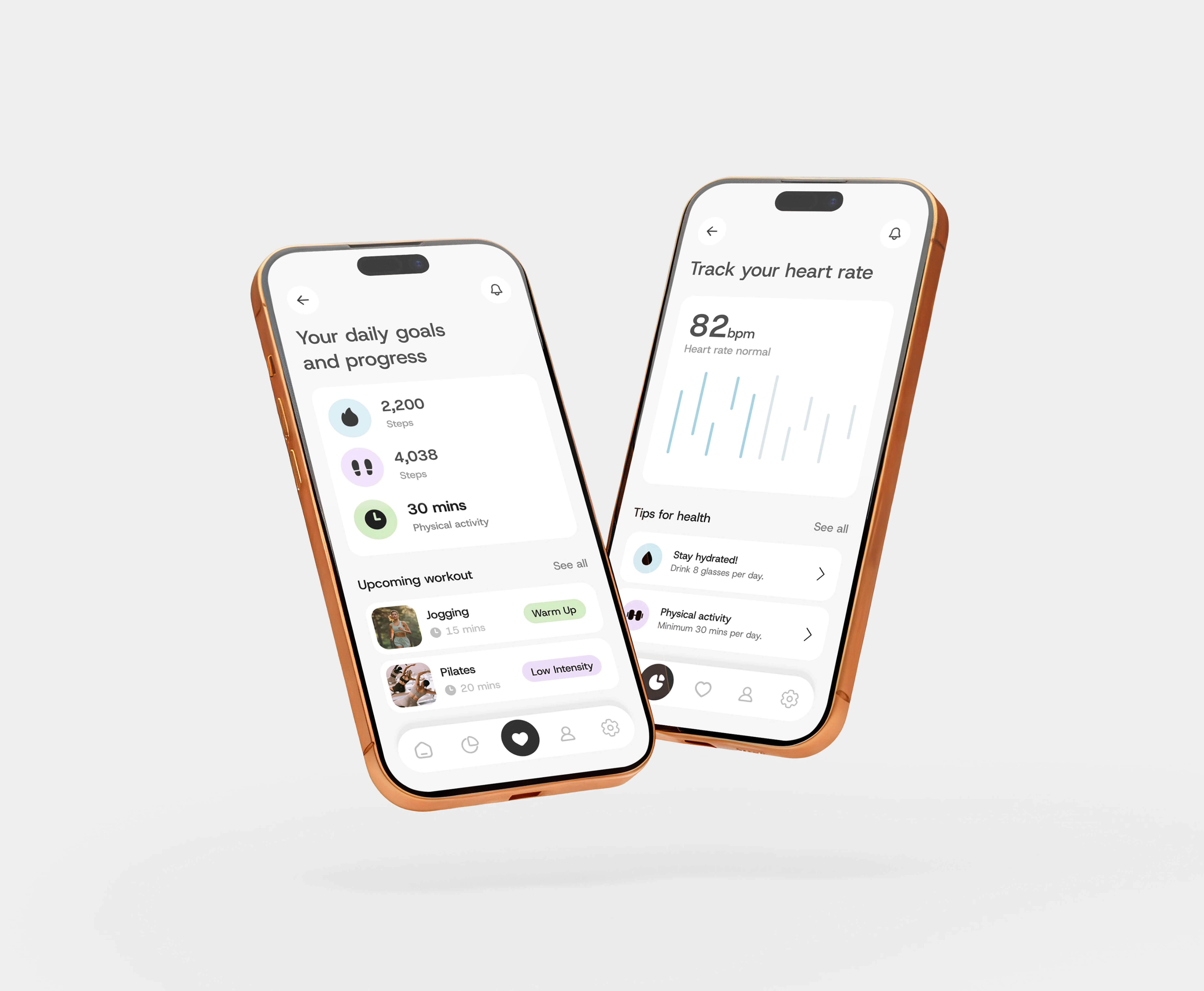
High-fidelity wireframes involved refining the initial layouts and applying an established style guide to simulate the finished app. Visual elements, typography, and colour were integrated to create a realistic representation of the final product. The app was also prototyped to test usability, interaction, and overall ease of use.
This project reinforced how powerful constraint-led design can be — limiting the app to only what a user genuinely needs in sixty seconds produced a sharper, more confident product direction. The biggest takeaway was the importance of alignment between aesthetics, user needs, and business goals — when all three work together, the result is a product that feels not just functional, but cohesive and intentional from every angle.